This post is part of a series on the open redesign of brianmuenzenmeyer.com using atomic design and Pattern Lab.
Anyone watching the open redesign progress mentioned above noticed big changes to the site in February, when elements of the site began to look more distinct and exhibit more structure. I set out to better understand the content hierarchy of the site while concurrently designing the look and feel.
Keep Calm and Iterate
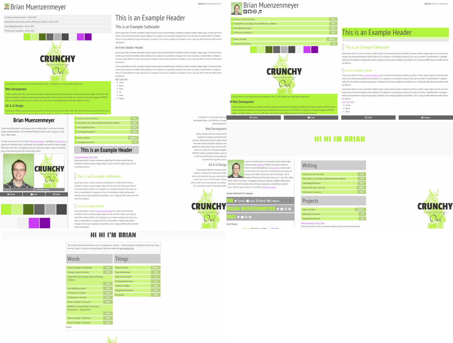
I chose to combine the use of http://styletil.es/ with my instance of pattern lab to explore concepts and then systematize them. I found the workflow to be acceptable— consisting of quick iterations of the style tile that exposed and refined patterns for eventual use. Utilizing simple versioning, I was able to build off of each style tile to gauge progress. You can see them all here:
- www.brianmuenzenmeyer.com/styletile/v1
- www.brianmuenzenmeyer.com/styletile/v2
- www.brianmuenzenmeyer.com/styletile/v3
- www.brianmuenzenmeyer.com/styletile
Or in gif form:

Some ideas that came and went along the way was the use of iconography, a purple complementary color scheme, and how much primacy I should give components like Crunchy Owl. The style tile is a great design tool because you can afford to cut a few corners. Load fonts any way you like, put everything in one scss file, no worries. To me, the deliverable is intentionally a little rough around the edges.
Moving Diagonally Is Difficult but Not Impossible
But this process was not without its challenges— most of my own making. As I said, style tiles should be rough collages (I compare style tiles to Pinterest to my clients now, as that is a good analog) and therefore devoid of layout. I tripped up on this along the way, and true enough, you can clearly see how my style tile iterations slowly evolve into something resembling a website layout. I don’t see this as bad, only cautionary, as you can too easily allow yourself to question layout when using these. This is where pattern lab came to rescue for me. After I’d discovered an interface element I liked, it was time to extract into a pattern. (Here’s an example of one of the subheadings)
Foundation Found
The combination of style tile iteration + Pattern Lab systemization allowed me to piece by piece construct the design I wanted. I did this enough times that by v5 I felt comfortable translating Pattern Lab concepts into the partials necessary to bring the site content to a fuller depth (btw, I detailed the process to do this here). Work remains, such as pagination, comments, and post templates, but from here I have a great start. I hope this workflow could perhaps be useful to you too!